Why the assessment form isn't converting, and the fix
A review of the /free-assessment/ and /contact/ forms on sunburstsolarsolu.com, scored against Demand Curve's landing-page and form-friction playbooks. Checked 13 October 2026.
Check these two first
- Leads go to a theStacc inbox, not the owners. Every form on the site sends to a theStacc developer's address, with no copy to Drew or Steve. Unless each lead is forwarded by hand, enquiries may never reach the people who call back.
- Nothing records a form submission. Analytics tracks call, email and quote clicks, but not "form sent". Unless the /thank-you/ page is set as a key event in GA4, the conversion rate you're seeing isn't measured. Fix this before judging any change.
The main form at a glance
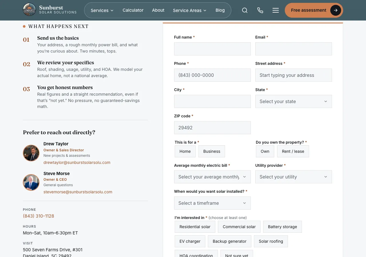
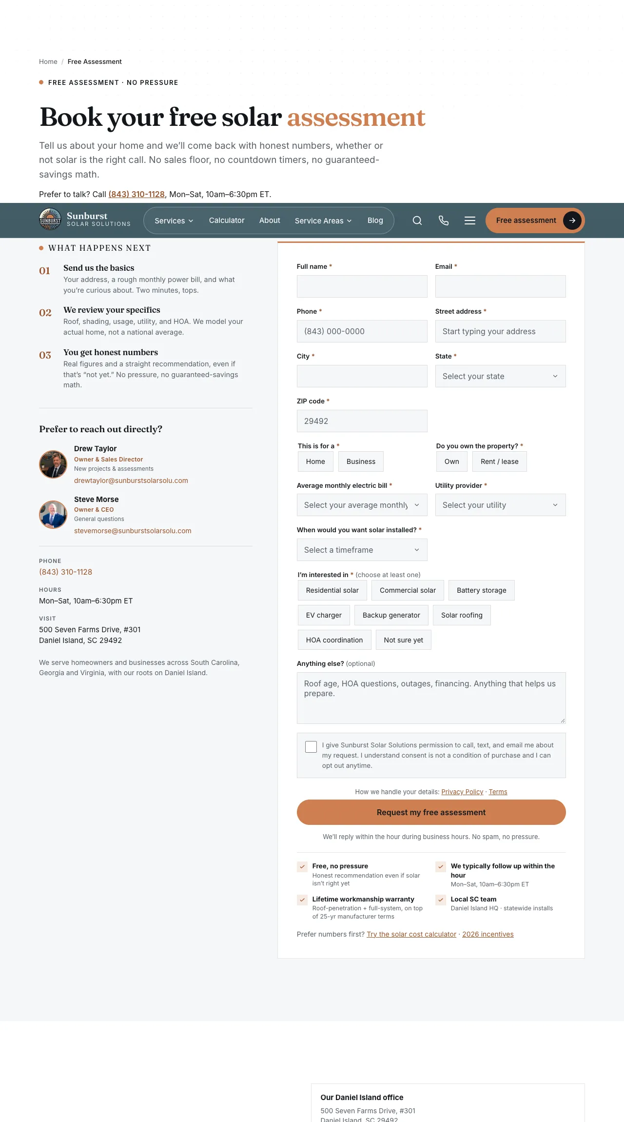
Step 01 next to the form promises "Two minutes, tops." The form asks for name, email, phone, street, city, state, ZIP, home or business, own or rent, monthly bill, utility, timeline, at least one interest, and a consent tick.
Scorecard
| Area | Score | Finding |
|---|---|---|
| Headline | 4 / 5 | "Book your free solar assessment" says exactly what happens. |
| Hook | 4 / 5 | "No sales floor, no countdown timers, no guaranteed-savings math" works well for pressure-wary homeowners. |
| Subheadline | 4 / 5 | Short, and backs up the promise of honest numbers. |
| Call to action | 2 / 5 | Every "Free assessment" button (14 on the home page) sends people to the heaviest form on the site. |
| Proof | 1 / 5 | No reviews anywhere, and the reviews page says they are "on the way". The only reassurance beside the form is two owner photos. |
| Objections | 4 / 5 | Strong: what happens next, no pressure, "we typically follow up within the hour", workmanship warranty, FAQ. |
| Effort and confusion | 1 / 5 | 14 required answers, repeated questions, and a consent tick that blocks the button. |
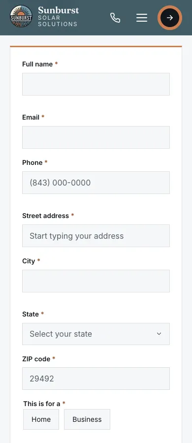
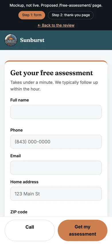
| Layout | 3 / 5 | A clean card, but very long. On a phone the button sits many screens down. |
What's hurting it
Too many questions
Fourteen required answers to request a free call. Every field is another moment to give up, and on a phone each one means a keyboard switch and a scroll.
Demand Curve: "use as few form fields as possible" (landing page checklist); field count hurts more than step count, especially on mobile (Baymard insight); every field is a "should I stop?" moment (checkout friction).
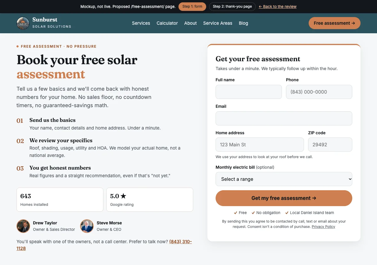
Fix: 5 required answers (full name, phone, email, ZIP, home address) plus an optional monthly bill. The rest comes on the call.
Questions that repeat each other
City and State are typed by hand even though ZIP gives both. "Home or Business" duplicates the "Residential or Commercial solar" chips. Timeline and the 8 interest chips are decisions nobody needs to make to get a phone call.
Demand Curve: get city and state from the ZIP; "don't ask residential or business unless it changes something."
Fix: remove City, State, Home/Business, Timeline and the chips. Pass the interest from the page the visitor came from in a hidden field.
A consent tick that blocks the button
"Permission to call, text, and email" is a required box, while the line right next to it says consent "is not a condition of purchase." It is one more thing to stop on, and it reads like a contradiction.
Fix: no tick box. Put one line under the button: "By sending this you agree to be contacted by call, text or email about your request. Consent isn't a condition of purchase. Privacy Policy." Add an opt-in box only if Sunburst later runs automated or marketing texting campaigns, which their texting provider will specify.
No proof at the moment of the ask
The visitor is asked for an address and phone number, and the only reassurance is the owners' faces. The reviews page openly says there are none yet.
Demand Curve: social proof right after the promise; specific proof beats vague claims.
Fix: put the proof beside the button: 643 homes installed and a 5.0 Google rating. Link the rating to the Google profile, and update the reviews page, which still says reviews are "on the way".
The good short form is hidden
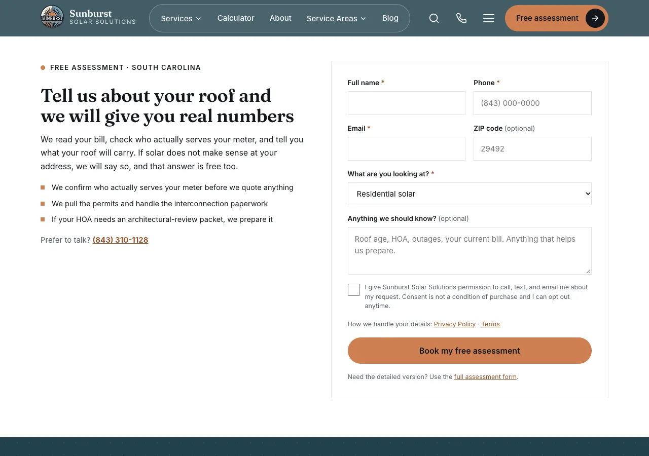
A 5-field form already exists at the bottom of the home and service pages, and it's close to right. But every main button skips it and goes to the long form.
Fix: make the short version the only form, at the top of /free-assessment/, and point every button there.
A small confusion point
The street field says "Start typing your address", which suggests an address lookup that doesn't exist. Keep the field (the address matters for the roof check), but either wire up an address lookup or change the placeholder to an example like "123 Main St".
Mockup: the new assessment page
The proposed /free-assessment/ page in Sunburst's own styling. Open the interactive mockup → Click through the form and the optional step 2, or open it on your phone.
What changed
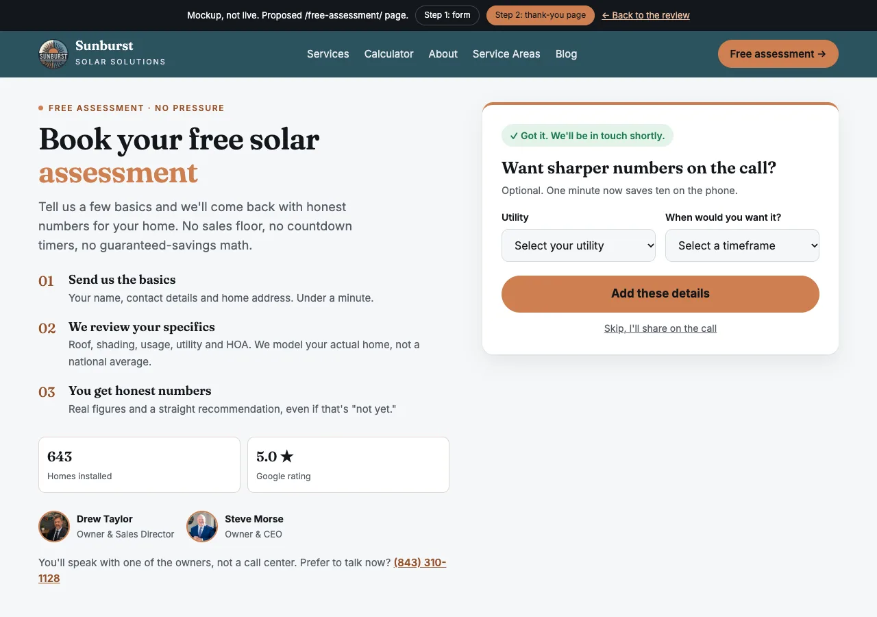
5 required answers instead of 14, including the home address. No tick boxes. A proof strip beside the ask: 643 homes installed and a 5.0 Google rating. Utility and timeline move to an optional step 2 after the lead is captured.
The recommended form
One short step to capture the lead. The extra detail is optional and asked after submitting, on the thank-you page.
Step 2, on the thank-you page (optional)
"Want sharper numbers on the call? Add your utility and timeline." The details arrive after the lead is already captured, so a visitor who skips it is not lost.
Removed from the required form
City · State · Own or rent · Home or Business · Utility · Timeline · 8 interest chips · Required consent tick
Top 3 fixes, in order
- Re-point the lead emails to the owners and count submissions. Add a
generate_leadevent on submit, so real leads and the real conversion rate are visible. - Cut the form to 5 required answers and make it the only form behind every "Free assessment" button.
- Replace the required consent tick with a line under the button, and add real proof beside the button as soon as the owners can supply it.